Blog, DESIGN, Press release
NOTIFICATION OF THE PANTONE 2020 COLOUR OF THE YEAR
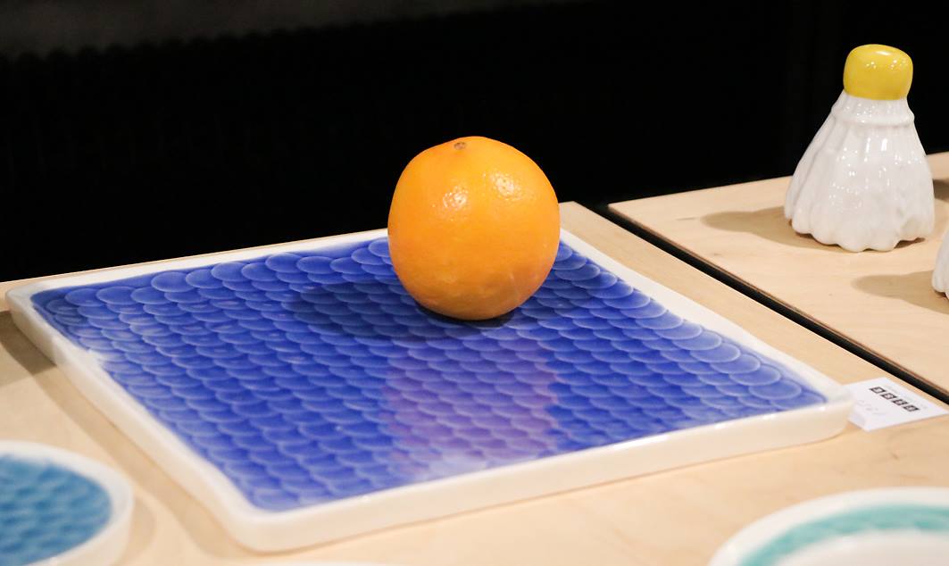
PANTONE 19-4052 Classic Blue
Creating peace of mind, confidence and connection, this lasting blue hue highlights our desire to build a reliable and stable foundation on which to build as we cross the threshold into a new era.
The timeless and durable blue shade of PANTONE 19-4052 Classic Blue in its elegant simplicity. The puzzling properties of PANTONE 19-4052 Classic Blue, referring to the climate at dusk, highlight our desire for a reliable and stable foundation on which to build when we cross the threshold into a new era.
Embedded in our psyche as a calm color, PANTONE 19-4052 Classic Blue creates a sense of peace and tranquility for the human spirit, offering refuge. PANTONE 19-4052 Classic Blue focuses our thoughts on promoting concentration and achieving laser-like clarity. Reflective blue shades of Classic Blue promote flexibility.
As technology continues to compete with human ability to process everything, it's easy to understand why we attract colors that are honest and offer the promise of protection. Non-aggressive and easy to restore, the reliable PANTONE 19-4052 Classic Blue offers unborrowable interaction. Coupled with the return of another day, this universal favorite is comfortably embraced.
PANTONE 19-4052 Classic Blue, the Pantone Color of the Year 2020
Introducing the Pantone Color of the Year 2020, PANTONE 19-4052 Classic Blue, a timeless and enduring blue hue elegant in its simplicity. Suggestive of the sky at dusk, the reassuring carrying of Classic Blue offer the promise of protection; highlighting our desire for a dependable and stable foundation from which to build.
Pantone Color of the Year
Pantone's Color of the Year has influenced product development and purchasing decisions in many industries for more than 20 years, including fashion, home furniture and industrial design, as well as product packaging and graphic design.
The process of selecting the Pantone Color of the Year requires thoughtful consideration and trend analysis. Every year, when Pantone colour experts arrive at the Pantone Colour Assessment Institute, the colour world is looking for new colour effects. These include the entertainment industry and films in production, traveling art collections and new artists, fashion, all areas of design, popular travel destinations, as well as new lifestyles, play styles and socio-economic conditions. Influences can arise from new technologies, materials, textures and color influences, relevant social media platforms and even upcoming sports events that raise awareness worldwide.